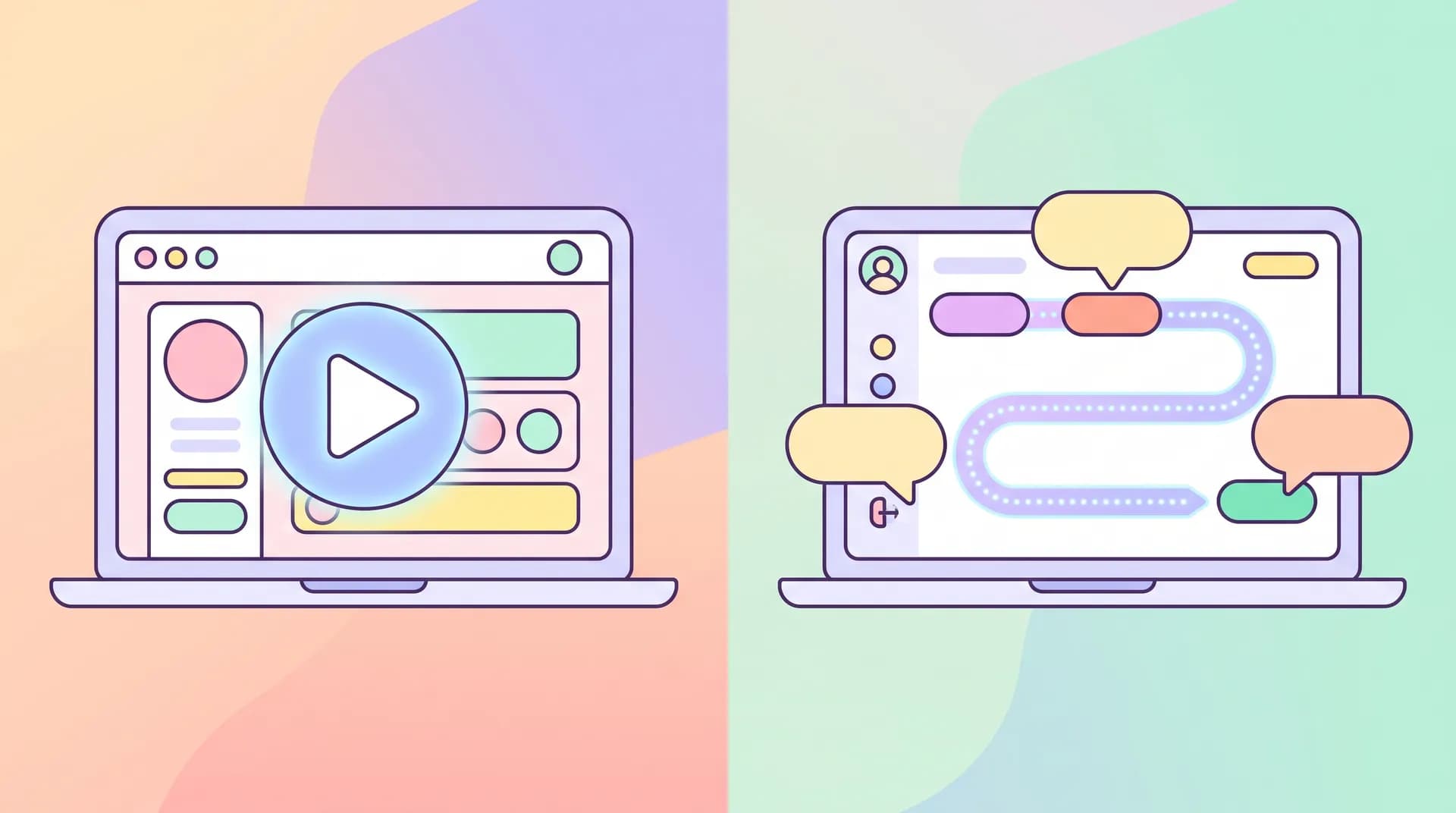
Onboarding video vs product walkthrough: pick per step
Onboarding video vs product walkthrough isn't an either/or choice. Here's how to pick the right format for each specific onboarding step.

I've watched teams burn three weeks arguing about whether their onboarding needs a video or a product tour, when the real answer was "both, at different steps." That debate is usually a proxy for a different problem: nobody's agreed on what's actually confusing users at each stage of onboarding video vs product walkthrough decisions.
Here's the thing I learned the hard way building Flare: the format doesn't fix confusion. Clarity about the step does. Once you know exactly where users stall, the format picks itself.
Onboarding video vs product walkthrough: the real decision framework
Most teams treat this as a philosophical choice — "we're a video-first product" or "we believe in interactive onboarding." That's backwards. The right call depends entirely on the kind of confusion you're solving at a given step.
Video wins when the problem is conceptual. Users don't understand why they'd do something, or they need to see a sequence that spans multiple screens, data sources, or outcomes before it clicks. A 45-second video showing a finished dashboard, a completed integration, or an end result builds context fast. You can't click your way to understanding "why this matters" — you need to be shown.
Interactive walkthroughs win when the problem is mechanical. Users know what they're trying to do but can't find the button, the field, or the setting. A tooltip pointing at the exact spot where they're stuck resolves that in two seconds. No video, however well-produced, beats a glowing arrow sitting right next to the thing someone's hunting for.
The mistake I see constantly: teams put a video where a tooltip was needed, or build an elaborate click-through tour to explain something that's actually conceptual. Both waste the moment.
A simple test for each step
Before building anything, ask one question for every onboarding step: is the user confused about what to do or why to do it?
- "Why to do it" confusion → video
- "What to do" confusion → interactive walkthrough
I'd also add a third category that people forget: "I don't believe this will work for me" confusion. That's not a UI problem at all — that's a trust problem, and neither format fixes it alone. You need social proof, a relevant example, or a founder explaining the use case directly. We cover this gap in more detail in our pillar guide on SaaS onboarding videos and user activation — it's worth reading before you decide anything else here.
When a short video beats a walkthrough
Video earns its place at specific, predictable moments. I've found four that show up in almost every SaaS onboarding flow.
The "why should I care" moment. Right after signup, before any setup, users are deciding whether this product is worth their time. A 20-30 second video showing the end state — "here's what your dashboard looks like once it's connected" — does more for activation than any empty-state tooltip ever will. Empty states are abstractions. Video shows the payoff.
Multi-screen or multi-step concepts. If a workflow spans three different screens and requires the user to understand how they connect, a tour forces them to click through blind, guessing at the next step. A video can show the whole sequence in 30 seconds, then the user goes and does it themselves with full context. This is the difference between "click here" and "here's the whole picture, now go."
Integration and setup steps that happen outside your product. If step four requires grabbing an API key from a third-party dashboard, a tooltip inside your app is useless — it can't point at a screen it doesn't control. A short screen-recorded video walking through the external steps, then returning to your product, solves this cleanly.
Anything that benefits from a human voice. Tone matters more than people admit. A founder or product lead narrating "here's why we built it this way" builds trust that a tour tooltip, written in clipped UI copy, simply can't carry. This overlaps with the trust gap I mentioned above — video is one of the few onboarding tools that can address both mechanical and emotional resistance at once.
Keep onboarding videos under 60 seconds. If you need longer than that to explain one step, the step itself is probably too big — split it, or clarify the single outcome you're driving toward first. Our guide on picking one onboarding milestone covers how to scope this correctly.
When an interactive walkthrough wins instead
Tours exist for one job: closing the gap between "I know what I want" and "I can't find it." They're cheap, fast to build, and infinitely more scalable than video for a specific category of problem.
Finding UI elements. Settings buried three menus deep, a toggle that's easy to miss, a field that's labeled ambiguously — these are pure findability problems. A tooltip pointing directly at the element, with one line of copy, resolves it instantly. No story needed.
Repetitive configuration steps. If your onboarding involves filling out five similar fields in a row, a click-through tour that highlights each one in sequence keeps users moving without making them sit through a video for something they can clearly see once pointed at it.
Steps where users need to do, not watch. Tours force action. Watching a video is passive — users can nod along and still not actually configure anything. A walkthrough that requires a click to advance guarantees the user actually touches the feature, which correlates far more strongly with retention than passive viewing does.
High-frequency, low-complexity steps. If a step is simple but gets missed often (data from your funnel will tell you this — see our breakdown on finding the exact stall point in your onboarding), a tooltip is cheaper to iterate on than reshooting a video every time your UI changes.
That last point matters more than people realize. Interactive tours live inside your actual product, which means when you change a button's location, the tour (if built with modern tooling) often adapts or at least breaks obviously. A video becomes silently wrong — it still looks fine, but it's now pointing users at a button that moved three pixels left and doesn't exist in that spot anymore. Nobody checks old onboarding videos for UI drift. I've shipped stale onboarding videos myself and only found out from a confused support ticket.
Cost and maintenance reality
Video costs more upfront — scripting, recording, editing, even a decent AI voiceover takes real time to get right. But it's relatively stable once your core workflow stabilizes.
Interactive tours cost less upfront but rot faster with UI changes. Every redesign means checking every tooltip anchor point. If your product ships UI changes weekly, that maintenance tax adds up quietly until someone audits the whole flow and finds half the tours are broken.
Neither is "cheaper" in absolute terms — they're cheap in different seasons of your product's life. Early-stage products with unstable UI should lean video for conceptual steps and keep tours minimal. Mature products with stable UI can invest more in tours since the maintenance cost drops.
Nielsen Norman Group's research on onboarding patterns backs this split: contextual help performs best for in-the-moment task completion, while upfront walkthroughs or videos perform better for setting expectations before a task begins. The format should match the cognitive job, not personal preference. (nngroup.com)
Combine them instead of choosing one
The best onboarding flows I've seen don't pick a side. They use a short video at the start of a flow to set context — "here's what we're about to do and why" — then switch to lightweight tooltips for the mechanical part of actually doing it.
Think of it as a relay, not a competition. Video hands off context, the tour takes it from there and gets the user to the click. This matches how people actually learn new software: understand the goal first, then get granular help hitting it.
A pattern that's worked well for teams I've advised:
- 20-30 second video at the top of a multi-step flow, explaining the end result
- Tooltip-based tour for each individual field or button within that flow
- A single contextual video re-appears only if a specific step has unusually high drop-off (confirmed through analytics, not guesswork)
That third point matters. Don't guess which steps need video. Pull your funnel data, find where people actually quit, and match the format to the actual failure mode at that specific step — not the one you assume is confusing.
Don't build a full interactive tour for your entire onboarding flow by default. Full-flow tours have notoriously high skip rates — Appcues and other onboarding platforms have reported that users click "skip" on long tours far more than they complete them. Reserve tours for specific, high-friction steps instead of narrating the whole product. (appcues.com)
How to decide without overthinking it
If you're starting from zero and don't have drop-off data yet, use this shortcut: map every onboarding step on a simple two-axis grid. One axis is "conceptual vs mechanical." The other is "how often does the UI around this step change."
Conceptual + stable UI = video. Mechanical + stable UI = tour. Conceptual + frequently changing UI = short video, but keep it generic enough to survive redesigns (screenshots of outcomes, not pixel-perfect UI walkthroughs). Mechanical + frequently changing UI = tour, and budget time for maintenance.
Run this exercise with your actual onboarding flow, step by step, instead of debating formats in the abstract. It takes maybe twenty minutes and it's more useful than any blog post arguing one format is universally better — including this one.
For teams without in-house video production, a lightweight AI-assisted tool can produce the short, outcome-focused clips this approach needs without turning into a full production cycle every time your UI shifts. That's a lot of what we built Flare around — fast, specific videos for exactly these moments, not polished explainer films nobody rewatches.