
SaaS User Onboarding Drop-Off: Find the Exact Stall Point
Learn how to diagnose saas user onboarding drop off using funnel and session data before you ever brief a video, hire an editor, or redesign a flow.

Every SaaS founder I talk to wants to talk about onboarding videos before they've looked at a single funnel report. I get it — a video feels like progress. You brief it, you ship it, you feel like you did something. But if you don't know where users are actually stalling, you're just as likely to make a beautiful video for a step nobody struggles with.
I've watched teams spend three weeks and a few thousand dollars producing a slick walkthrough for their dashboard, only to find out 60% of signups never even made it past email verification. The video was great. It solved nothing.
So before you write a single script, you need to diagnose saas user onboarding drop off properly. That means pulling real funnel data, watching real sessions, and finding the exact step where people give up — not the step you assume is confusing because it's the one your team finds confusing.
Why Guessing at SaaS User Onboarding Drop Off Wastes Money
Here's the uncomfortable truth: most onboarding assumptions inside a company are wrong. The people building the product know it too well. They can't see the step that trips up a first-time user because they've clicked through that exact flow five hundred times.
I've made this mistake myself. At Flare, early on, we assumed our connect-your-account step was the killer. It felt clunky internally. Turns out our actual drop-off cliff was one screen earlier — a permissions request that looked like spam to half our signups. We never would've found that by debating it in a Slack thread.
Without data, you end up solving the problem that's loudest in your head, not the one that's actually costing you activated users. And a video produced against the wrong hypothesis doesn't just fail to help — it adds a layer of cost and false confidence that makes the real problem harder to spot next time.
Pulling the Funnel Data That Actually Matters
Start with a step-by-step completion funnel of your signup and first-session flow. Not a vague "activation rate" metric — an actual ordered list: signup started, email confirmed, account created, first workspace created, first core action completed, second session returned.
Tools like Amplitude or Mixpanel are built for exactly this. If you're not already tracking onboarding as a formal funnel with named steps, that's step zero. You can't diagnose what you haven't instrumented.
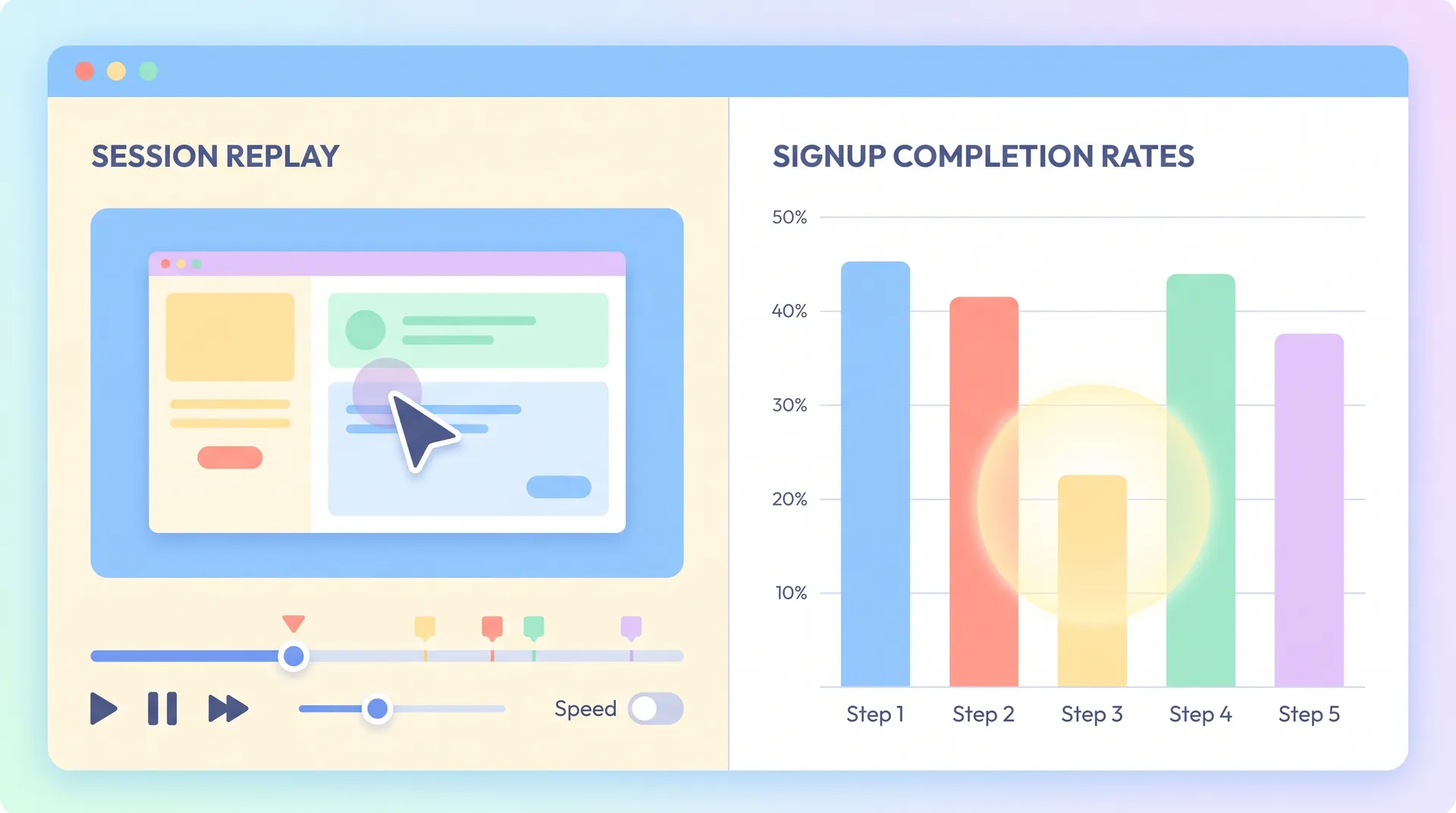
Once the funnel's built, look for the single biggest percentage drop between two adjacent steps. Not the step with the lowest absolute completion — the step with the steepest cliff relative to the step before it. A 90% to 40% drop between steps three and four is your priority, even if step seven only has 20% of users left by then. That's compounding loss from earlier, not a new problem at step seven.
Write that number down. Literally put it in a doc: "Step 3 to Step 4, we lose 50% of remaining signups." That's your diagnosis target. Everything else is secondary until you understand that cliff.
Segment Before You Conclude Anything
A single aggregate funnel can lie to you. Break it down by acquisition channel, by device, by company size if you're B2B. I've seen cases where the overall funnel looked fine but mobile signups were dying at 80% while desktop was clean. Averaging the two hid a real, fixable problem.
Check time-of-day and day-of-week patterns too. If drop-off spikes during a specific period, that can point to a server latency issue rather than a UX problem — which is a very different fix than a video.
Watching Session Replays to See the "Why"
Funnel data tells you where. Session replays tell you why. This is the part teams skip because it's slower and less glamorous than staring at a dashboard, but it's where the real insight lives.
Tools like Hotjar or FullStory let you filter recordings to just the users who dropped at your identified cliff step. Watch at least 15-20 of those sessions back to back. You're looking for patterns: rage clicks, dead scrolling, repeated hovering over the same button without clicking, form fields getting abandoned halfway through.
I do this exercise myself every quarter. It's humbling. You'll watch someone hover over a button for eight seconds, clearly reading the label, then just... close the tab. That's not a video problem. That's a copy problem, or a trust problem, or the button genuinely doesn't do what they expect.
If you see users repeatedly clicking a non-interactive element, that's usually a signal they expected it to do something — a classic case where a short contextual video or even a static tooltip can resolve confusion faster than a redesign.
Pay attention to rage clicks especially. Research from the Nielsen Norman Group has long documented that users will attempt the same failed action multiple times before giving up entirely — each rage click is a small, quantifiable moment of frustration you can actually watch happen. That pattern, repeated across dozens of sessions, is about as close to a smoking gun as UX research gets.
Deciding If a Video Is Actually the Right Fix
Not every stall point needs a video. This is the part people get wrong in the other direction once they've found their data — they assume diagnosis automatically means "make a video now."
Sometimes the fix is a copy change. Sometimes it's removing a field from a form. Sometimes it's a permission request that needs better framing before the user ever sees the system dialog. A video is the right call specifically when the stall is caused by a lack of understanding of what to do next, or uncertainty about why a step matters, not when it's caused by friction, bugs, or bad UI.
Ask yourself three questions once you've found the cliff step:
- Are users confused about what the step does or why it's required?
- Is the friction cognitive (don't understand) or mechanical (can't click the right thing)?
- Would 20-30 seconds of context change their behavior, or do they need the step removed entirely?
If it's cognitive confusion, a short, targeted video embedded right at that step can lift completion meaningfully. I've covered the mechanics of building that kind of video properly in our pillar piece on SaaS onboarding videos and real user activation — worth reading once you've confirmed video is actually the right lever, not just the comfortable one.
If the friction is mechanical or structural, no video fixes that. You need to simplify the step itself first.
Pick One Milestone, Not the Whole Flow
Once you've confirmed a stall point needs explanation rather than redesign, resist the urge to explain your entire product in the fix. The video — or the in-app message, or the tooltip — should address that one step and nothing else. We go deeper on why narrowing to a single milestone outperforms a full feature tour in SaaS onboarding first useful outcome: pick one milestone. The short version: users don't need to understand your whole product at the point of drop-off. They need to understand this one next action.
This is also where timing matters in how you request feedback or follow-up contact from users who do convert. If you're layering customer proof into onboarding, the same lifecycle logic applies — our piece on how to ask for testimonials by lifecycle stage covers that timing question in more depth.
A Simple Weekly Cadence to Keep Doing This
Diagnosing drop-off isn't a one-time project. It's a habit. Here's the loop I run:
- Pull the funnel every week, same day, same metric definitions.
- Flag any step where the week-over-week cliff percentage moves more than 5 points.
- Watch 10 session replays for that step before concluding anything.
- Classify the cause: cognitive, mechanical, or technical.
- Ship the smallest fix that addresses the cause — video, copy, or structural change.
- Re-check the funnel the following week to confirm the cliff actually moved.
Teams that skip step six are the ones who end up with a graveyard of onboarding videos that nobody watches and nothing measurably improved. Don't ship and forget. Ship, measure, and be honest if it didn't work.
Keep a simple log of every onboarding change you ship alongside the funnel metric it targeted. Six months from now you'll want to know which fixes actually moved the needle versus which ones just felt right at the time.
Stop Treating Video as the Default Answer
I'll say this plainly because I think it needs saying: video is a tool, not a strategy. The strategy is understanding exactly where and why users stall. Once you have that, video becomes one option among several, and often the right one for cognitive friction specifically. But it only works when it's aimed at a real, data-confirmed problem.
If you take one thing from this: don't brief a video until you can point to a specific step, a specific percentage drop, and a specific reason pulled from actual session recordings. Everything else is a guess dressed up as a plan.