App Demo Video Creator: Screen Capture vs Human Demo
An app demo video creator doesn't have to choose one style. Here's my practical framework for blending screen recordings with human reactions that convert.

I've watched hundreds of app demo videos get submitted for campaigns, and I can tell within three seconds which ones will convert. It's never the ones with the cleanest screen recording. It's the ones where a real person reacts to what's happening on screen like they actually give a damn.
That's the tension every app demo video creator runs into eventually. Do you record the phone screen and let the UI speak for itself? Or do you put a face on camera and let a human sell the feeling? Most creators pick one and stick with it. That's the mistake. The best app UGC blends both, and there's a repeatable way to do it.
Why "app demo video creator" work is different from SaaS demo work
Mobile app demos live or die in the first two seconds of a scroll. Nobody's sitting through a 90-second walkthrough on TikTok the way they might click into a SaaS demo video from a landing page. If you're producing longer-form product demos for desktop software, the pacing and proof points are a different animal entirely — I've written about that split in detail in the deeper SaaS demo production guide, and it's worth a read if you're also selling into B2B buyers.
But for apps, you're optimizing for a scroll-stopping feed clip, not a sales-qualified lead. That changes everything about how you combine screen capture and human presence.
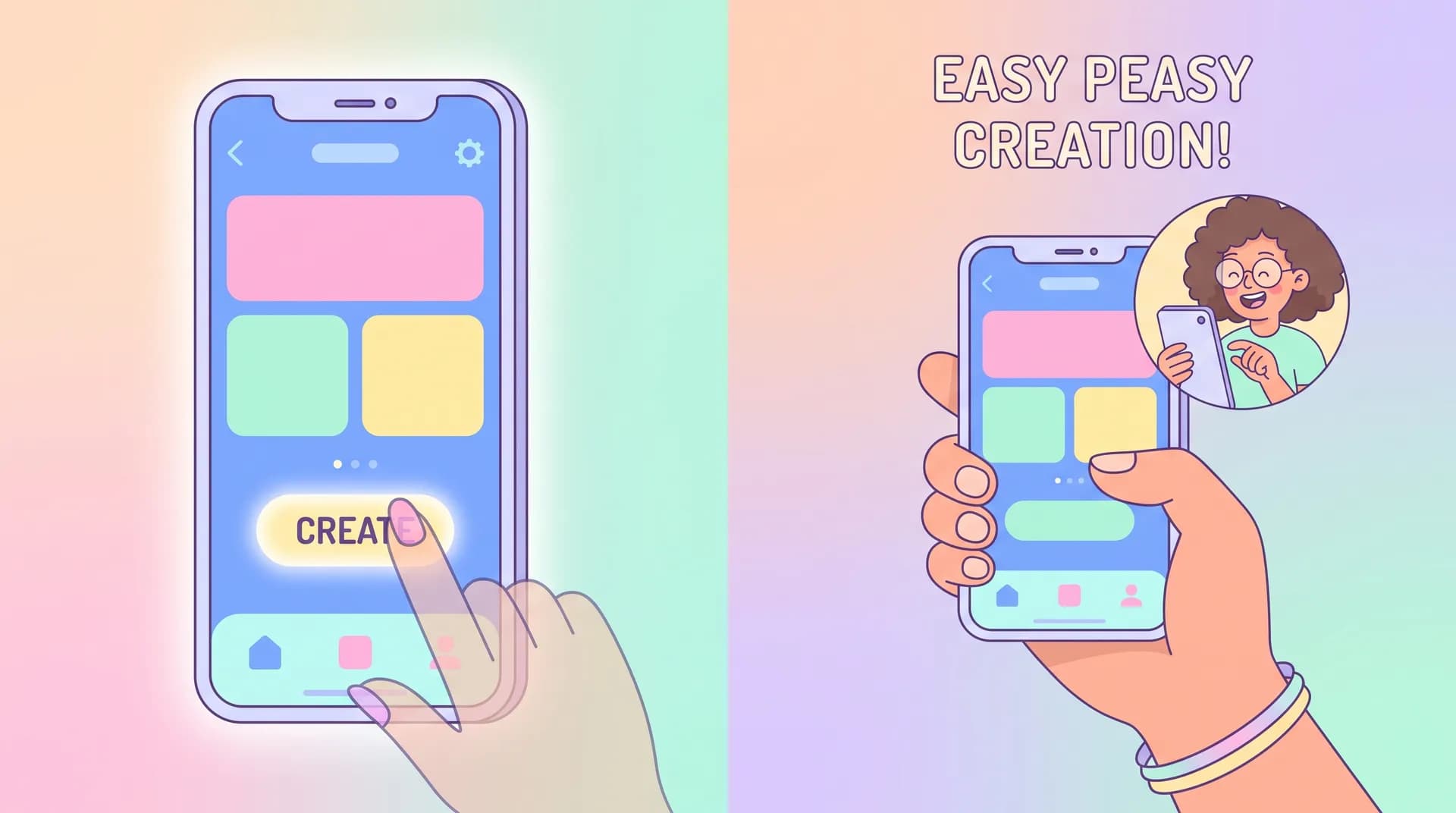
Screen recordings alone look like App Store preview videos. Competent, sterile, forgettable. Human-only reaction videos, without any screen proof, feel like an ad — viewers assume you're paid to say nice things and they scroll past. The combination is what reads as authentic: a real phone, in a real hand, with a real person reacting to real results.
The trust gap screen-only demos can't close
Screen recordings are great at showing what the app does. They're terrible at showing why anyone should care. A silky onboarding flow means nothing if the viewer doesn't see a human's face light up when the result lands. I've run split tests where identical screen-capture footage performed 30-40% worse on hook rate when we stripped the creator's on-camera reaction and replaced it with text overlays instead. Viewers trust faces. It's not complicated, it's just biology.
The blended framework: four shot types, one timeline
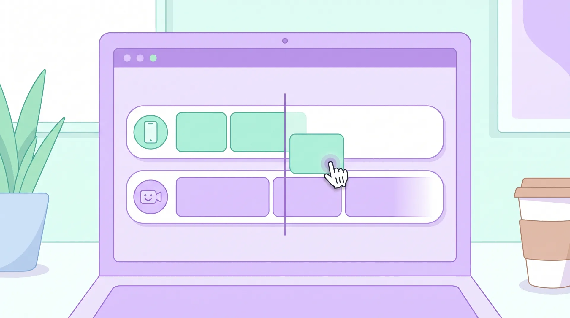
Here's the structure I give every creator before a shoot. Four shot types, cut together in a specific order. You don't need fancy gear — a phone, a tripod or phone mount, and decent light gets you there.
1. The cold open (human, on-camera) Three seconds, max. Creator looks at the camera and states the problem or the hook. "I didn't think a budgeting app could actually stop me from overspending." No screen yet. This is pure trust-building, pure face time.
2. The screen proof (phone capture, no face) Cut straight to the phone screen. Show the actual tap-through — opening the app, hitting the feature, seeing the result. Keep this tight. Five to eight seconds is plenty for most single-feature demos. This is where the app UGC earns its credibility; it's not a mockup, it's a real device doing a real thing.
3. The reaction cut (human, on-camera) Back to the creator's face reacting to what just happened on screen. This is the emotional payoff — surprise, relief, delight, whatever's authentic to the use case. This shot does more conversion work than people give it credit for.
4. The close (human or screen, with CTA) Either the creator talking directly to camera with a soft CTA, or a final screen shot showing the end state (confirmation screen, result dashboard, whatever proves the outcome) with a voiceover CTA layered on top.
That's it. Four beats, usually under 20 seconds total for a TikTok or Reels cut, maybe 30-45 seconds if you're building a longer app demo video creator asset for a landing page or paid placement.
Shoot your screen recording and your on-camera reaction as two separate passes. Trying to hold the phone, operate the app, and react naturally all at once almost always looks forced. Screen record first, then react to playback on a second phone or monitor while filming your face.
Briefing creators so the blend actually works
The framework only works if the creator understands it before they hit record. I've seen too many briefs that just say "show the app and react naturally" — that's not a brief, that's a hope.
Instead, be specific about:
- Which single feature or outcome gets the full four-beat treatment. Don't try to cram five features into one UGC clip. Pick one job the app does well and build the whole video around proving it.
- What the reaction should actually be. Relief for a finance app. Excitement for a gaming app. Quiet satisfaction for a productivity app. Tell the creator the emotional target, not just "be excited."
- Where the screen capture needs to start and stop. Give timestamps or a tap sequence so the creator doesn't record ten minutes of meandering app use and expect you to find the good part in editing.
This is the same logic I use when writing briefs for onboarding-focused creator content — if you haven't nailed down the one useful moment you're trying to capture, read through the app onboarding video brief piece, since the "pick one outcome" principle applies directly here too.
Finding creators who can actually pull this off
Not every UGC creator is equally good at both halves of this. Some are fantastic on camera but fumble screen recordings — shaky capture, laggy taps, bad lighting on the phone glare. Others can screen record cleanly but read lines like they're being held hostage.
When I'm vetting creators for app campaigns, I ask for a sample that includes both elements, even if it's rough. You're not looking for polish at the audition stage. You're looking for someone who can hold a natural reaction and operate an app smoothly at the same time, because that's the actual skill this format demands. I go into more depth on sourcing creators who genuinely use the product (not just read a script cold) in how to recruit creators who actually use your app — it matters more for this blended format than almost any other UGC style, because faked familiarity with the UI shows up instantly on screen.
Watch for creators who screen record with notifications, low battery warnings, or a messy home screen visible before they open your app. It's a small detail that tanks trust fast — viewers notice clutter even when they're not consciously looking for it.
Editing: where most blended demos fall apart
Even with great footage, editing can kill the format if the cuts feel mechanical. A few rules I hold editors to:
Match the energy of the cut to the energy of the moment — fast cuts on screen taps, a beat of stillness on the reaction shot so it actually lands. Don't cut away from a genuine facial reaction too fast; give it half a second longer than feels natural in the edit, because on playback it reads as more authentic, not slower.
Keep captions tied to the screen action, not the face. When the phone is on screen, captions should narrate what's happening or call out the result. When the face is on screen, let the expression do the talking — don't caption over it unless you're reinforcing a CTA.
Audio matters more than people think here too. If you haven't dialed in your creator's mic setup, it undercuts the whole blend — a crisp reaction with muddy audio reads as cheap no matter how good the visual cut is.
If you're building this into a broader acquisition strategy rather than a one-off asset, it's worth stepping back and reading the mobile app marketing with creator content guide — this blended demo format is one tactic inside a much bigger playbook covering paid amplification, ASO, and creator sourcing at scale.
What this looks like at scale
Once you've got the four-beat framework working with one creator, the real unlock is repeating it across a roster without losing quality. I've found the biggest time sink isn't the shoot itself — it's the back-and-forth of explaining the blend to every new creator, reviewing raw screen capture for notification clutter, and syncing reaction cuts to the right screen moments in editing.
That's honestly the exact workflow problem we built Flare around — managing briefs, feedback, and asset handoff for creator videos without it turning into an email thread nightmare. But whether you use a tool for it or just a shared doc and a tight brief template, the principle holds: separate the screen pass from the human pass, brief the emotional target explicitly, and never let either element carry the whole video alone.
FAQ
Frequently Asked Questions
What's the best way to combine screen recording and on-camera video in an app demo?
Do I need professional equipment to make an app demo video as a creator?
How long should an app demo UGC video be?
Why do screen-only app demos underperform?
How do I brief a creator for a blended app demo video?
Can one creator handle both the screen recording and the on-camera reaction?
Related reading
- Mobile app marketing with creator content: the full guide
- App Onboarding Video Brief: Script the First Useful Moment
- How to Recruit Creators Who Actually Use Your App
- UGC video production: your complete beginner's guide
- UGC content creator: what you actually do day-to-day
Sources referenced: patterns on short-form hook rate and retention drawn from TikTok's own creative best practices, research on video trust signals from Nielsen's ad effectiveness studies, and mobile UX benchmarking from Nielsen Norman Group.