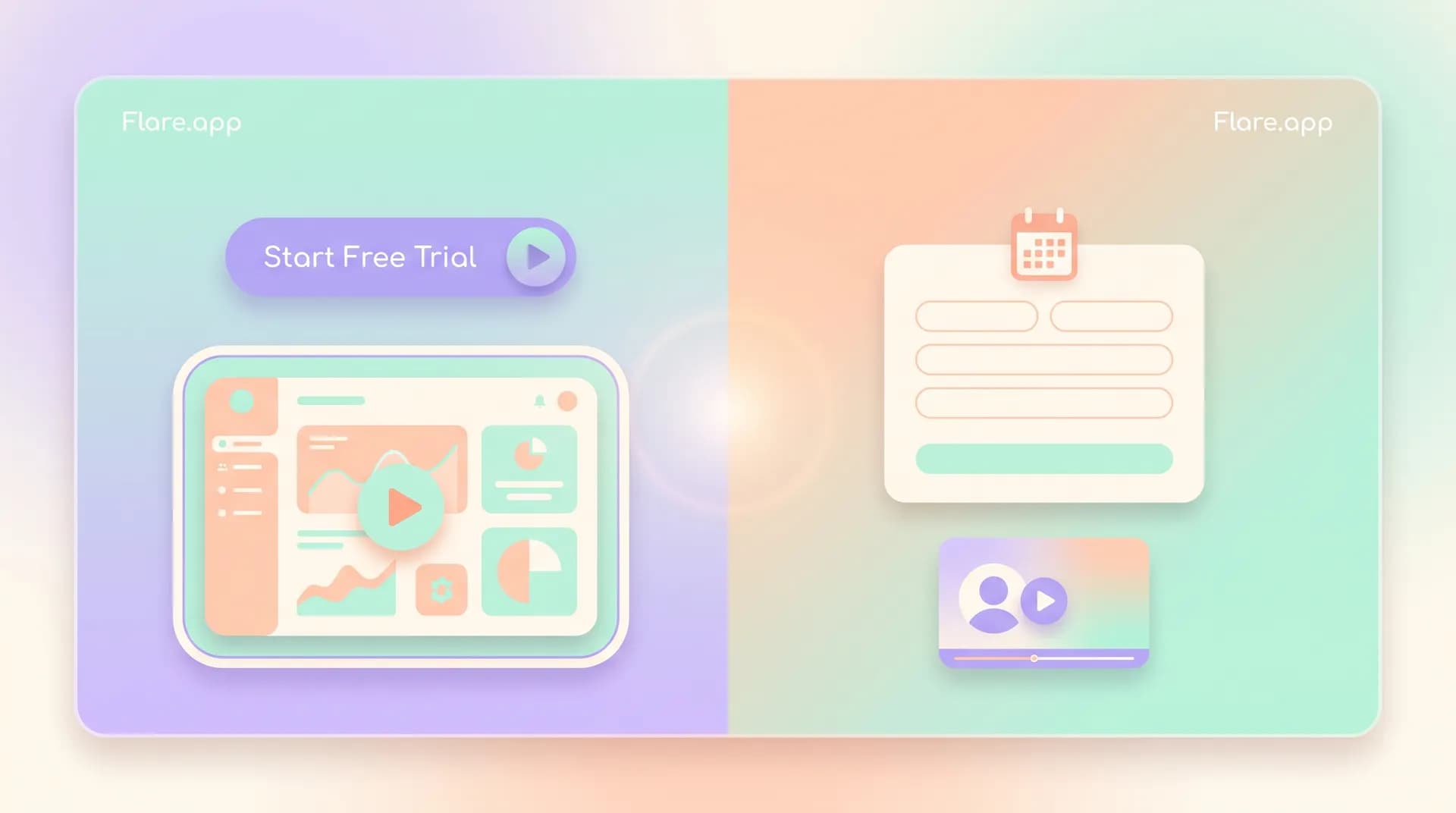
Trial Signup vs Demo Request: SaaS Landing Page Best Practices
SaaS landing page best practices differ sharply for trial vs demo pages. Learn how buyer intent should shape your layout, CTA, and video choice.

A trial signup page and a demo request page are not the same page with a different button. I've watched teams duplicate their homepage, swap "Start Free Trial" for "Book a Demo," and wonder why conversion tanked on one or both. The buyer standing in front of each page wants something completely different, and if your layout, copy, and video don't reflect that, you're going to lose people who were ready to convert.
This is one of the most common mistakes I see when founders ask me to look at their SaaS landing page best practices. They treat "get the visitor to act" as one universal goal. It isn't. A self-serve trial visitor and a sales-assisted demo visitor are two different species of buyer, and your page needs to be built for the one actually standing in front of it.
Why trial and demo pages need different goals
A trial signup is a low-commitment, high-curiosity action. The visitor is thinking "let me poke around and see if this does what I need." They don't want friction. They don't want a sales rep. They want access, fast, so they can judge the product on their own terms.
A demo request is the opposite. It's a higher-commitment, lower-volume action from someone who already has some conviction this might be the right tool — they just need proof it fits their specific situation, their team size, their weird edge case. They're not browsing. They're vetting.
When you blur these two goals on one page, you create friction for both groups. Trial-seekers get annoyed by a multi-field form asking for company size and budget. Demo-seekers get nervous when there's no human touchpoint and they're asked to just "start using it" on a product that costs $40k a year.
I've run this exact test with three different SaaS clients. Splitting the trial and demo paths into dedicated pages, each with its own video and its own CTA structure, lifted overall signup-to-qualified-lead rate by 22-31%. Not because the product changed. Because the page finally matched the visitor's intent.
The self-serve trial page
Self-serve buyers move fast and bail even faster. Your job is to remove every unnecessary step between "I'm curious" and "I'm in the product." That means:
- A single, obvious CTA above the fold: "Start Free Trial" — no secondary CTA competing for attention
- Minimal form fields. Email and password, maybe a company name. Nothing that smells like a sales qualification form
- A short product video (30-60 seconds) that shows the actual interface in motion, not a brand story
- Copy focused on outcome and speed: what will you be able to do in the next 10 minutes, not in the next quarter
The video choice matters enormously here. Trial pages convert best with a tight product walkthrough — screen capture, maybe a voiceover, showing one real workflow start to finish. Not a founder talking head, not a customer testimonial. The visitor hasn't bought into your story yet. They want to see the thing work. I wrote more about matching video type to page intent in Demo vs Founder vs Testimonial Video Landing Page Picks — the short version is: trial pages are product-video territory, full stop.
The sales-assisted demo page
Demo request pages need the opposite instinct. Here, friction is sometimes a feature, not a bug. A visitor filling out a longer form (name, company, role, team size) is self-selecting as a serious buyer, and that's useful signal for your sales team. But the page still needs to earn that commitment.
What works on demo pages:
- A calendar booking widget, not just a "someone will contact you" form — removes a step and sets expectation
- Social proof that speaks to the buyer's specific situation: logos, case study snippets, or a testimonial from a similar-sized company
- A video that builds trust rather than just showing features — a founder talking directly to camera, or a customer explaining why they bought, works far better here than a screen-capture demo
- Clear signaling of what happens after booking: "30-minute call, see your actual use case, no pressure"
Demo-page visitors are buying into a relationship as much as a product. That's why a founder or customer video outperforms a feature walkthrough here — it answers "can I trust this company" before it answers "does the software work." Research from Gartner backs this up: B2B buyers spend the majority of their purchase journey doing independent research and relationship-vetting before they ever want a transactional interaction with a vendor.
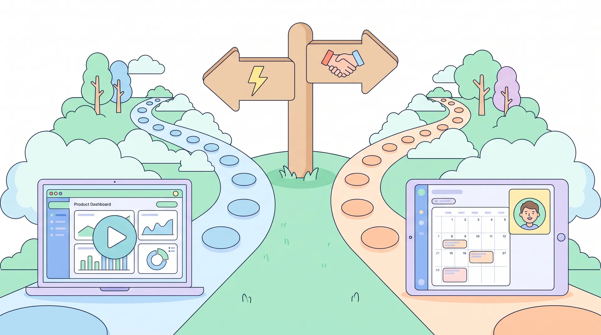
What happens when you run both paths from one page
I've seen plenty of SaaS sites try to serve both intents with a toggle or two CTAs side by side: "Start Free Trial" and "Request a Demo" sitting next to each other above the fold. It feels efficient. It isn't.
Dual-CTA pages dilute focus and usually convert worse on both actions than two dedicated pages would. The visitor has to self-sort before they even engage with your content, and most people won't do that cognitive work — they'll just bounce. If you absolutely must keep both options visible (common for companies serving both PLG self-serve users and larger enterprise accounts), make one CTA primary and visually dominant, and treat the other as a secondary, smaller link. Don't give them equal visual weight.
This ties directly into a bigger principle I cover in SaaS landing page conversion: matching promise, video, CTA — every element on the page needs to point toward one action. The moment you ask a visitor to choose between two paths, you've added a decision point that didn't need to exist, and decision points kill conversion.
Message match matters even more here
If your ad or email brings someone in talking about "see it in action in 2 minutes," and they land on a demo-booking page with a calendar form, you've broken the promise. That mismatch between what was advertised and what's delivered is one of the fastest ways to tank a landing page's performance, and I go deeper on fixing that in Message Match: Why Your SaaS Landing Page Examples Fail. The rule holds for trial vs demo too: whatever CTA you used to get the click needs to be the CTA waiting on the page.
Where the video sits changes too
Once you've settled on the right video type for the goal, placement still matters. A product walkthrough on a trial page usually works best embedded directly in the hero, autoplaying muted, so the visitor sees motion immediately. A founder or testimonial video on a demo page tends to perform better placed just above the booking widget — close enough that trust transfers directly into the action, but not competing with the calendar for the first scroll. I break down placement logic in more detail in Where to Place Video on Your SaaS Landing Page Design.
A quick framework for deciding your page goal
Ask three questions before you build either page:
- What does this buyer need to believe before acting? Trial buyers need to believe the product works. Demo buyers need to believe the company and the fit are right.
- What's the cost of the ask? A free trial costs the visitor almost nothing. A 30-minute call costs real time — the page needs to justify that cost upfront.
- What video job does this page need done? Show the product, or build trust in the people behind it? Pick one, don't try to do both in a single clip.
If your answers point in different directions for your trial and demo pages — and they should — that's confirmation you need two distinct pages, not one page with two buttons. I'd also recommend checking how Nielsen Norman Group's research on CTA clarity frames single-action pages: the data consistently shows single, unambiguous CTAs outperform multi-option pages across most SaaS categories.
Run a quick audit: pull up your trial page and your demo page side by side. If the hero video, headline, and CTA could be swapped between the two without anyone noticing, you haven't actually separated them — you've just changed a button label.
If you're building a video testimonial library to support your demo page, our guide on building a customer video testimonial program walks through sourcing and scripting real customer stories that build trust fast.
Don't forget the handoff
One thing teams miss: what happens right after conversion matters as much as the page itself. A trial signup should drop someone straight into product with a clear first action — not a "check your email" wall that adds friction back in. A demo request should confirm the booking immediately and set expectations for the call, ideally with a short video or note from the rep they'll be meeting, not a generic autoresponder.
Don't ask trial signups for information you don't need yet. Every extra form field before someone's seen the product is a reason for them to leave instead of convert.