
Where to Place Video on Your SaaS Landing Page Design
Above-the-fold or below? Here's how video placement near your CTA affects SaaS landing page design and conversion, with patterns that actually work.

I've watched teams spend three weeks producing a beautiful demo video, then bury it so far down the page that maybe 20% of visitors ever see it. That's not a video problem. That's a placement problem, and it's one of the most common mistakes I see in SaaS landing page design.
Video doesn't convert on its own. It converts when it's positioned to do a specific job at a specific moment in someone's decision, right next to the button you actually want them to click. Get the placement wrong and you've built an expensive distraction. Get it right and the video does half your sales pitch before a rep ever gets on a call.
SaaS Landing Page Design: The Core Placement Decision
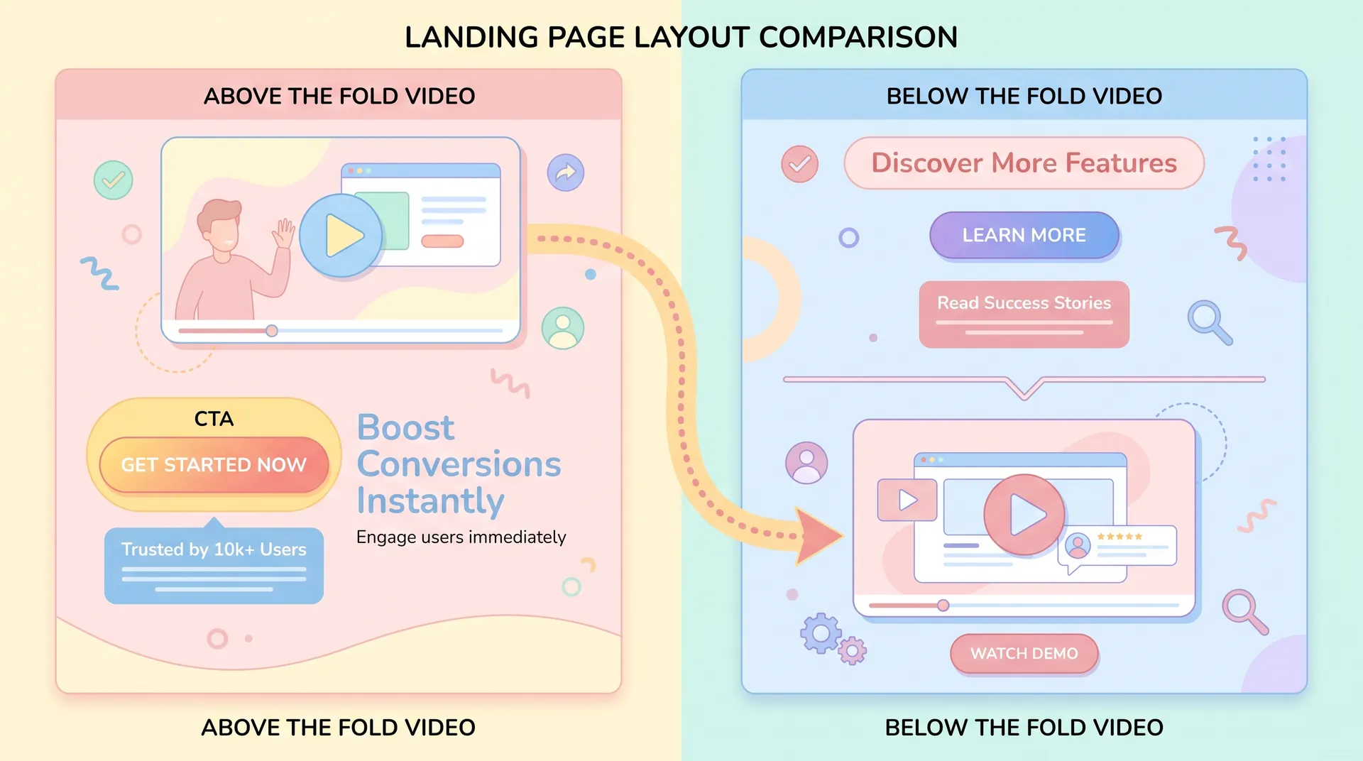
Every SaaS landing page has one real decision to make about video: does it go above the fold, competing for attention with your headline and CTA, or below the fold, where it supports a visitor who's already warming up?
There's no universal right answer. But there is a wrong way to think about the question. Most teams ask "will video increase engagement?" The better question is "what does this visitor need to believe before they click my CTA, and where in their scroll does video deliver that belief fastest?"
I covered the bigger picture of matching your promise, your video, and your CTA in our pillar guide on SaaS landing page conversion. This post zooms into just one piece of that: where the video physically sits relative to the button you want clicked.
Above the Fold: High Risk, High Reward
Putting video above the fold means it's the first thing visitors see, often before they've even read your headline properly. This works when:
- Your product is hard to explain in text alone (complex UI, visual workflow, spatial tool)
- You're running paid traffic from ads that already set context, so visitors arrive ready to watch
- Your CTA is low-commitment (free trial, not "book a demo with sales")
The risk is real though. A HubSpot study on landing page elements found that autoplay video above the fold can actually depress time-on-page if it competes with the headline for attention. I've seen this firsthand with Flare customers: when a 90-second product video sat directly above a signup CTA with no supporting copy, conversion dropped compared to a version with a 15-second looping clip and three bullet points next to it.
The fix isn't removing video above the fold. It's keeping it short, muted by default, and designed to support the CTA rather than replace the pitch entirely.
Below the Fold: Video as a Second Chance
This is the placement most underrated teams get wrong in the other direction — they assume below-the-fold video barely gets watched. It does, just by a different audience. Visitors who scroll past your hero section are already curious. They didn't bounce. They're looking for proof before they commit.
Below-the-fold video works best positioned right before a feature breakdown or directly above a secondary CTA repeat. Think of it as answering the objection that your hero section couldn't fully address. If your headline makes a promise ("Cut onboarding time in half"), the below-the-fold video is where you prove it with a real workflow walkthrough.
Patterns That Work With a Single Primary CTA
Here's the part most SaaS teams get backwards: they treat video and CTA as separate decisions, designed by separate people, then bolted together in a Figma file at the last minute. The two need to be designed as one unit.
Pattern 1: Video-Left, CTA-Right (Hero Section)
Classic split layout. Video or looping GIF on one side, headline plus CTA button on the other. This works because the eye naturally travels from motion (video) to the static anchor (button) — assuming the video is cropped to draw the eye rightward, not leftward.
I'd avoid centering both video and CTA stacked vertically above the fold. It forces a scroll decision before the visitor has seen either element fully, and you lose people in that gap.
Pattern 2: Video as the CTA Trigger
Instead of a passive video next to a button, make the video itself the trigger. A thumbnail with a play button that, once watched, reveals the CTA with fresh urgency ("Ready to try this yourself?"). This pattern works particularly well for founder-led pitches. If you haven't built one of these yet, our breakdown on founder-led video content strategy covers how to script a short clip that earns this kind of attention.
Pattern 3: One Video, Two CTA Instances
Place a single video above the fold, then repeat the identical CTA copy and button below the video section once more, lower on the page. Don't introduce a second, different offer here — that's a classic way to confuse intent. Nielsen Norman Group's research on landing page scanning behavior backs this up: visitors scan in predictable F- and Z-patterns, and inconsistent CTAs break that scan path and cause hesitation.
Test placing your video immediately above the fold line rather than squarely within it. Visitors often treat "above the fold" loosely — a thumbnail peeking into view can pull a scroll without demanding full attention upfront.
Pattern 4: Testimonial Video Lower, Demo Video Higher
If you're running both a product demo and a customer testimonial, don't cram them into the same section. Demo video belongs closer to the primary CTA because it answers "what does this do." Testimonial video belongs further down, closer to a secondary or final CTA, because it answers "can I trust this." We go deeper on choosing between these formats in our comparison of demo, founder, and testimonial video picks.
If you're building out a testimonial library for this purpose, our guide to running a customer video testimonial program walks through sourcing and structuring those clips properly.
What Actually Kills Conversion Near the CTA
A few placement mistakes I see constantly, in no particular order:
Autoplay with sound. Nobody wants their speakers blasting a voiceover the second a page loads. Mute by default, always.
Video that loads before the CTA button. If your video asset is heavy and delays the button rendering, you've created a conversion blocker, not a conversion aid. Lazy-load the video, not the button.
No visual hierarchy between video and CTA. If your video thumbnail is larger and more colorful than your CTA button, the eye stops there. Buttons need contrast and size that competes, even next to motion.
Mismatched message between video and button copy. If your video promises "see how X works" and your button says "Start Free Trial," that's a small gap, but it's a gap. Tighter copy alignment between the video's framing and the CTA label reduces hesitation. This is really a message-match problem more than a placement problem, and I wrote a full breakdown on fixing that mismatch in this piece on message match between ads and landing pages.
Don't place two different videos competing for attention in the same viewport as your CTA. I've seen teams add a demo video and a founder video side by side above the fold, thinking more proof equals more trust. It splits attention and tanks click-through on both.
A Simple Test You Can Run This Week
You don't need a full redesign to figure out where your video should live. Run this instead:
- Record your current scroll depth and heatmap data for two weeks (Hotjar or Microsoft Clarity both work fine for this)
- Note the pixel position where your CTA currently sits and whether video is above, inline, or below it
- Move video placement by one section — if it's above the fold, try pairing it with your first below-fold CTA instead
- Hold everything else constant: same copy, same CTA color, same traffic source
Run this for at least 1,000 sessions per variant before calling it. Anything less and you're reading noise, not signal.
Placement tests are cheap compared to video production. If you're unsure whether a full remake is worth it, test placement of your existing video first — you might solve the problem without touching the edit.